

 |  |  |

Requires: Script-Fu, some font
Placement: <Toolbox>/Xtns/Script-Fu/Utils/Text Separate
| Result |
 |
Separate Text script has been written as an aid for game developers. Its purpose is to help convert black and white, possibly scalable (and quite sophisticated) X window fonts into something more useful in computer game (i.e. simple, dumb and fancy).
This script does not of course try to force any solution for the problem of ideal and most suitable game font format. Instead it separates the characters from the font in a way which is assumed to be easy to convert into format specific for the given game --- for example with my RAW plugin :-)).
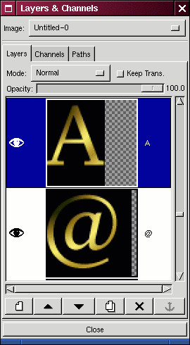
The Text Separate script works as such: it draws each character from the specified string into separate layer in a new image with current foreground color. It makes required background, either transparent or filled with current background color. Finally it optionally applies gradient to the letter to make it nice.
All characters are aligned to common baseline and into the left. The right margin of the layer should corespond to character width. Due to a simple-minded algorithm for harvesting font informations, the right margin might be actually a bit misplaced. I will be grateful for a better algo :-). The height of all layers is the same. I hope that it allows for variable spaced font yet does not complicate the char positioning. The name of each layer is the character itself.
The whole image is trimmed to the size of the biggest layer. Needless to say, the image can contain many layers. It seems that GIMP or Script-Fu do not like it and frequently hose themselves. Or there's a bug in the script. Ahem. If you find out, please write (Don't forget to remove the '!spam-' string from the address!).
|
|
Note: This version is compatible with GIMP 1.1.22
Grab the source code for Gimp 1.1
 |  |  |